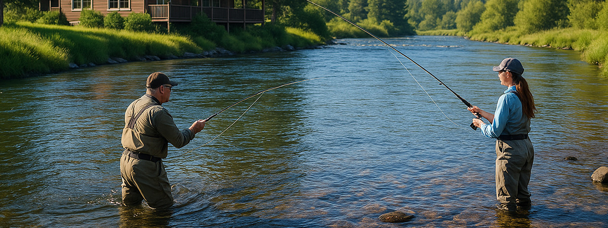
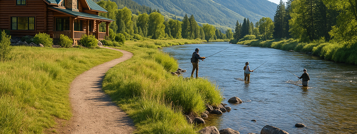
Most fishing lodges put real effort into their websites—beautiful photos, warm language, maybe even a drone video or two. But once you start reading, something’s missing. What do they actually offer? How do you book? What makes this lodge different from the others?
In our recent review of over 100 fishing lodge websites, we found a consistent pattern: unclear messaging, vague homepages, and missing content that leaves visitors unsure of what to do next. That’s a problem—because when messaging isn’t clear, bookings don’t happen.
This article dives into the most foundational element of a successful fishing lodge website: clarity and messaging. We’ll cover why it matters, what most lodges get wrong, and what to do instead if you want your website to work as hard as you do.
Say What You Do—Fast
When someone lands on your site, you’ve got just seconds to make an impression. That doesn’t mean impress them with poetry—it means clearly telling them who you are, what you offer, and why they should care.
Too many fishing lodge websites open with vague headlines like “Welcome to Paradise” or “Your Next Adventure Awaits.” These don’t help visitors understand what kind of trips you offer, where you’re located, or what makes your lodge different. Strong messaging is clear and benefit-driven:
“Remote Alaska Fly Fishing Lodge | Trophy Trout, Comfortable Cabins, Floatplane Access” is far more effective.
In our audit of 100 lodge websites, we looked at how clearly each one communicated throughout the site—especially on the homepage, but also on key subpages like trip overviews and lodging details. The average score for clear, benefit-driven messaging was 4.7 out of 7, but consistency was rare. Even lodges that nailed the top section of their homepage often failed to follow through—leaving visitors confused or searching for answers.
The homepage was the most common weak spot, with 39% of sites scoring below average in clarity. If it doesn’t quickly and confidently explain what your lodge offers—and who it’s for—you risk losing interest before visitors ever click deeper.
Good messaging doesn’t just live at the top of your homepage. It should be baked into every key page: what you offer, how it works, and why it’s worth booking.
Purpose-Driven User Flow
Your homepage might be where most visitors land, but the real goal is to move them forward—to explore your trips, understand your lodge, and ultimately book a stay. That process is what we call user flow, and it extends well beyond the homepage.
Too many lodge websites feel more like digital brochures than functional tools. We saw pages that looked beautiful but left users guessing where to click next. Others buried critical information two or three layers deep, with no prompts or clear CTAs to guide the way.
Only about 66% of lodge websites showed any meaningful sign of purposeful user flow. And even among those, very few maintained that structure beyond the homepage. Navigation often lacked hierarchy, internal links were sparse or missing, and the path to booking was anything but obvious.
A well-structured site gently guides visitors through the decision-making process. It starts with a strong homepage, but continues through clear menus, helpful page layouts, and intentional calls to action that support the visitor at every stage—from first visit to final click.
If your site doesn’t have a clear, intuitive path forward, don’t be surprised when visitors drop off before taking action.
Robust Content Strategy

A strong lodge website needs more than just a handful of pretty pages. It needs depth—content that informs, engages, and builds confidence with potential guests. That includes clear trip descriptions, lodging details, FAQs, and yes, content that changes over time.
Unfortunately, this is where most lodge websites fall short. In fact, over 60% of sites we reviewed scored below average when it came to having a truly robust content strategy.
Some lacked basic essentials—no species list, no explanation of what’s included, no breakdown of how trips work. Others had decent core pages but nothing that evolves over time. No blog. No trip reports. No seasonal updates. That’s a missed opportunity not just for engagement, but for SEO.
Google rewards fresh content. So do return visitors and curious prospects who want to know what’s happening now. Without a blog, news section, or some type of ongoing content, your site begins to look abandoned—even if your lodge is fully booked.
A robust content strategy doesn’t mean you need to write weekly. It means creating a foundation of helpful, trust-building content—and showing signs of life. The more real, informative, and up-to-date your site feels, the more likely visitors are to stick around, come back, and eventually book.
Strategic, Well-Placed CTAs

Call-to-action (CTA) elements are one of the simplest, most overlooked tools for turning visitors into booked guests. Yet too many lodge websites either hide them, soften them into vague copy, or forget them entirely.
We’re not just talking about buttons. CTAs can take many forms—like a bold strip promoting a seasonal special, a homepage grid linking to trip options, or a section prompt encouraging visitors to check availability. What matters is that they’re clear, strategically placed, and guide the user forward.
In our audit, this was the weakest-performing category in the entire clarity & messaging section. Only 36% of lodge websites had strong, well-placed CTAs across their key pages.
Some sites had one lonely button at the top of the homepage—and nothing else. Others relied on vague language like “Learn More” or buried booking prompts several clicks deep. A visitor should never have to guess what to do next.
Every key page—homepage, trip details, lodging, about—should include a clear, purposeful call to action. Whether it’s booking a trip, reading more, or simply reaching out, your site should make it easy (and obvious) to take the next step.
If your site doesn’t ask for action, most visitors won’t take it.
Conclusion: Clarity Converts
Your website doesn’t need to be flashy to be effective—but it does need to be clear.
Across the 100 lodge websites we reviewed, the biggest missed opportunities weren’t in fancy design or high-end features. They were in the basics: messaging, structure, content, and calls to action. These aren’t small issues. They directly affect how long visitors stay on your site, how confident they feel in your lodge, and whether they actually book.
If your messaging is vague, your pages disjointed, or your CTAs missing, you’re likely losing bookings you never even knew were possible.
The good news? These are fixable problems. And they often start with a shift in perspective—from showing off your lodge to guiding your visitors.
Want to know how your lodge stacks up? We’re happy to take a look.